How do you make your digital products more accessible?
If you are a crochet designer, chances are that many of your customers or potential customers are in some way disabled, neurodivergent, or come from a different culture than you, with a different knowledge base.
The suggestions below will increase the chances that someone will buy or use your patterns if you apply even one of them.
The more, the better, in my opinion, and after a while they become second nature.
Based on my own experience as a crochet designer of nearly a decade now, I have compiled a list of things you can do to make your designs more accessible to a wider audience.
Implementing them should translate into better sales or ad revenue over the long term.
Contents
Acceptance versus Accommodation
It’s Autism Acceptance and Accommodation month! Yay, not just “awareness”, now there’s actionable stuff too.
I think most of the world knows by now that autistic people exist and that there’s a big chance that there’s an autistic person watching them or listening to them or stimming close by or just existing on this planet.
OK, I know that’s not what “awareness” is all about. Theoretically it should let people know not only that we exist, but also what makes us different and what makes us behave the way each of us does (we are not all the same, despite what some NGOs might want you to think – that’s the whole point).
Awareness is not enough. Accommodations are needed and not just for autistic people. I happen to be one autistic person, but I care about the well-being of more than fellow autistics, I care that any disability should be accommodated so that people can live fulfilling and enjoyable lives.
There are many accommodations for various disabilities (visible or invisible) that require physical space to be modified, research to be done so they help as many people as possible, so these take a lot of resources (which should be available, I believe, more so than resources geared towards “researching” ways of destroying autism in the womb or whatever else “autism researchers” are up to nowadays).
But if you’re like me and work in a digital environment and create things that are digitally accessible, creating accommodations is a lot easier and the tools are already there for you.
All you need is a little (ahem) awareness and a willingness to learn a little, go just a bit out of your way to help a whole group of people that have been pretty much ignored by the crafting community over the decades.
Of course, you can go all in into the research that already exists and overdo everything and burn out, but there’s also a middle road. One you could easily take, only add a little more to your workload, but make an important contribution to the world.
What am I talking about? I’m talking about making things easy to read by everyone, not only those of us with sharp close-range vision (haha, I’m one of those because I’m extremely near-sighted).
I’ve been researching (not very actively) this topic for the past several months, after I discovered that there’s a group on Ravelry (of all places!) for accessible patterns.
I have zero memories of how I found this group (possibly someone shared it on Instagram, so maybe we should share this info more often, just saying), but it fascinated me the moment I did find it.
I knew about alt text (and have been using it wrong in my blogs my whole life, but that’s another article for another day) and I know some people with limited vision who need to use accessibility tools to work on their computers, but this was a revelation.
You don’t need to just rely on technology, you can be active in helping people access and use your digital products.
Renee Van Hoy is the expert host of this group and has created both a course to help designers create accessible patterns that you can find in her Etsy shop here (including a review for one pattern, which I think is an amazing opportunity), as well as an accessible pattern index that is funded through this class and Kofi donations. Read more here about the index.
I haven’t yet taken the course, it’s on my list, but I did start adding easy read versions of my patterns to my shops (not all of them, as Lovecrafts doesn’t like multiple files, but my Yarnandy shop, Etsy and Ravelry all offer multiple files).
I’ve also watched (listened to while crocheting) the interviews Renee had with Kristina and Sarah of Tech Tip Talks here and with Claire from the Making Stories magazine here.
I’ve added the links because there’s so much good information in these interviews and I’d like to have them saved somewhere to watch again later on, see what I missed.
Some reasons why you should add large font versions to your digital products
Apparently you don’t even need to have vision problems to benefit from large font text. Even if you have processing differences it might be easier for you to read larger text.
These include ADHD, dyslexia, other things we are not yet aware of (this is why I love my Kindle, I can read on it in any font size I want, depending on how I feel at certain times and whether the text is made up of walls of text).
Even if we only consider vision issues, most people start to lose close-range eyesight at about 40–50 years old. It’s a natural process and we use glasses for correcting this loss, called Presbyopia.
But most people don’t go to the optometrist when they turn 40 if they never had vision problems in their life (hell, it took me over a year of squinting at the blackboard from the first row and watching fuzzy streetlights before I thought that maybe that’s not how things should look and got glasses for my myopia).
If we make the text large enough, these people won’t need glasses to read our stuff. There is more than one solution to a problem.
Which is not to say that you should not see an optometrist or wear your glasses if you have them, please do and get the best correction that is available for you. But some issues cannot be fully corrected with glasses and in those cases an easy to read version is essential.
How to make your digital products more accessible — my personal guide
All that being said, how am I increasing accessibility for my digital products?
1. Including charts in your patterns
This one takes a little bit of time, skills and resources you might not have at the moment, but it’s so worth it.
For mainly visual people like me, working from a chart can be infinitely easier than following along with written instructions.
What’s more, they are international, especially if you use the industry standard symbols in your chart, so people from all over the world can recognize the stitches in your chart, regardless of which language they speak.
You do need to be familiar with charts before you start adding them in your crochet or knitting pattern, but they add a much-needed layer of accessibility in your patterns.
If you don’t want to learn to make your own charts or just don’t know where to start, I offer charting services to crochet designers. Check them out here.
I’ve also created a series of articles about crochet charts and the best software to try out based on your needs. Check out the articles here.
2. Creating easy to read PDF versions
First, as I mentioned before, I started making easy read versions for my patterns. As of writing this, I have 12 patterns with the low vision attribute on Ravelry (I need to add tags and a filter plugin to my shop to see this information, that’s getting on the to do list). Four of those 12 are regular crochet, the rest are Tunisian crochet.
Can you guess why that is? For one, I’ve mostly been publishing Tunisian crochet patterns over the last few months, but I’ve also been updating older patterns, so that can’t be the reason why…
The real reason is that in regular crochet I usually publish 2 pattern files — one with US terms and one with UK terms.
It’s all about accessibility, again. So I need to edit two files for each pattern and put them in the easy to read format, which follows these exact requirements:
- 24 point Arial font;
- 26 and 28 point and bold for headings;
- black text, white background;
- left justified, 1 inch margins;
- no columns;
- page numbers bottom left;
- no charts;
- all abbreviations explained in the list.
It takes a while to do all these edits, but of course I always have to tweak something else in the original files, so it takes a while.
I also have to read this list every time I make an easy read version because I always miss something. I’ll blame it on my ADHD (ahem, I blame everything on it, like hating to learn “history” in grade 6, that was such a struggle I had full on meltdowns).
You might think “Other designers only offer instructions in US terms or UK terms and sometimes don’t even mention which version it is and people make amigurumi with US term double crochet stitches, why bother with so many files?”.
To which I will respond that if you really want to have accessible patterns, language is the first step. Then large fonts and black text.
The benefit to creating these files with large font is that people can print them and take them with them wherever, not being stuck to a PC and yet being able to use your digital product in an offline format.
I’m sure many people print my patterns, so I try to make print-friendly versions without photos interspersed within the text, so the easy read version should be the same.
3. Changing the font size of your website
If you offer free patterns as blog posts and monetize your blog, you can also increase readability for the people who use your website.
There’s a lot to be said about these blog posts and improving readability, but you can start form the theme that you use and customize it to show large fonts to begin with.
A 24 point font looks nice on a modern ultra-wide (excessively wide) monitor like a full HD or 4K one that are currently sold and in use in many households.
Often times I find myself zooming in on various pages on the internet (hold down CTRL on your keyboard and use the scroll wheel on the mouse to do that) because I simply can’t see the text or it’s tucked into a tiny side of the page.
4. Adding a sizing plugin to your website
Another way to increase readability of your digital products, especially if you offer them on your blog, like many crochet designers do, is to add a little plugin that lets people increase or decrease the font size.
You can prevent people having to do this by using a large font to begin with. I’ve just updated my website to have a base font size of 24 and people can increase or decrease that with the aid of a little plugin that I installed.
Update: since publishing this blog post, I have uninstalled the plugin because it was causing issues with my website loading times. By that I mean that it added a lot of lag and issues with text moving around.
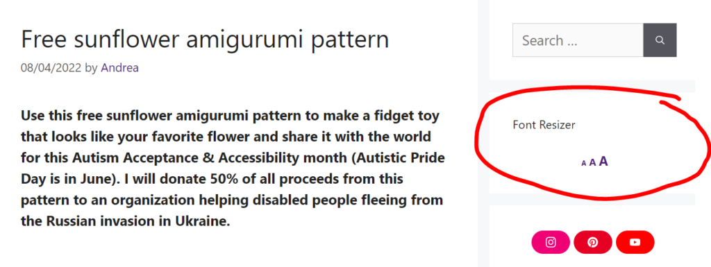
I know there are other plugins and that there are other platforms as well, so you’ll need to search how to do this for your own platform if you don’t use WordPress.
I’ll be looking for a better solution for this, but for now am content with the default large font size.
5. Using tables of contents and spacing
Use your headings! Don’t be afraid to break up your content into chunks and to add headings and a table of contents at the beginning of your post, especially if it’s a long one.
Ideally, you have a table of contents with all your important headings at the beginning, large text, and the little button on the side that takes you back to the top of the page when visitors want to find other sections in your blog post.
Website style sheets (CSS, baby) add some spacing between paragraphs by default, but in your PDFs only you control how much space there is between paragraphs and even how long paragraphs are.
Walls of text are difficult to read for most people, but for some they are impossible. Break up your content with paragraph breaks and use those paragraph spacing tools you have in your text/layout editor.
It’s so much easier to read small chunks of text and much easier to remember where you left off if you’re like me and your eyes wander around while reading.
That being said, you can also emphasize bits of the text and those can be used as anchors by people like me who read one sentence here, one sentence there, go back and read three paragraphs before because I was thinking of something else while reading.
The ladies at Tech Tip Talk also had their most recent interview with a knitting designer who’s also a graphic designer and who insisted on these little things that you can do to improve readability in your digital products. Check it out for more on this topic.
6. Screen reader accessibility
This one is a little more complicated when it comes to crochet or knitting patterns (or beadwork, embroidery and other similar crafts that require symbols).
Rule no.1: no charts!
While in easy read versions you may have charts if they are large (think Sc symbol should be the size of a 24 point font small character like an x) and have a written equivalent, in screen reader accessible patterns and other digital products charts are off limits.
You need to find ways to communicate the pattern in written/spoken instructions and that do not require visual aids to be completed.
The easiest way to think of it is like telling a story. Except in this case the story is the pattern. The order in which you say the instructions is essential and you need to communicate important information ahead of time.
An example Renee gives is mentioning how many pattern repeats you have in a row before the pattern repeat. Also replacing various symbols found throughout pattern repeats with words or similar equivalents.
Knitters like to use asterisks a lot to represent pattern repeats and even nested pattern repeats, but a screen reader won’t read *this section* as “asterisk this section asterisk”, but only as “this section”.
I personally use square brackets and say “repeat [stuff] X times” to make sure that people know it’s a repeat, but I’ll still have to change the wording when I edit a pattern to make it screen reader accessible to put the “X times” before the actual instructions for the repeat.
I haven’t yet developed wording for this and I’m hoping Renee’s course includes information on this, but it will probably be something very verbose.
I hope people who use screen readers don’t mind verbose, because I don’t know how to express myself otherwise and this is one of the things keeping me back from making at least a few of my patterns screen reader accessible.
This is a lot more work than making easy to read versions and you really do need some experience with such things and hopefully someone who can test your stuff with their screen reader software and give honest and useful feedback.
7. Include an audio version of the pattern
Another option is making audio patterns directly, as if you were telling someone next to you what they should do next.
This also takes a lot of time to make and might be a lot of fun with simple patterns where you have pattern repeats.
You can make a screen reader friendly pattern and read it out and make an audio version and upload it on a podcast-type platform or as a sound-only video for people to follow along and skip back and forth to the stuff they need.
I’m thinking it would be nice to have the option to add chapters like in audiobooks, so you can skip to the next or previous row. Which brings me to videos.
8. Create videos with closed captions
Videos are the best of several worlds. They are visual, but also audio, have chapters and can have captions too.
Ideally you narrate everything you do and then add captions to the video for people who can’t hear what you’re saying.
I have a separate article about how to add captions to your YouTube videos and you don’t really need to do all that much, just edit them to remove the absurdities and add some punctuation.
I know they are a lot of work, but I also think they are super useful for people to learn how to make new and interesting things, to interact with you and what you have to offer.
I started making videos for my patterns in 2019 and even though I don’t have lots of views, about 30% of them are from people who use the closed captions. That’s immense!
Of course, that also takes into account the people who use the auto-translate feature, but that’s extra accessibility. You can reach people who don’t understand your language, but who can watch you and follow along with the (badly) automatically translated captions.
If you can afford to hire someone to translate your captions correctly, even better!
Final thoughts
Phew, that’s a lot of things you could be doing to improve disabled peoples’ access to your digital products, be they patterns, courses or other similar products that you access through a computer or a tablet or a smartphone.
I’m sure there are many things that I forgot to mention, so if you can think of any, please put them in the comments and I may (forget to) add them to the article.
Also, please read the comments in case someone wrote something interesting, I always love reading comments and learning from them, no matter what website I read (boo to all the websites that have no comment section or that make it super difficult to find the comments and read them/contribute).
If you’ve made it to the end of this article, good on you! Look who’s got some concentration going.
I hope you learned something and that you’ll start applying some of these tips in your work. Start with one and see where that leads you.
Actually, bookmark this page or pin it to your secret “self improvement” board and start with the interviews I linked, then come back here and pick one thing you’d like to do. Let me know in the comments which it is and I’ll do my best to support you (just keep in mind that I’m not exactly in the target audience here, so my feedback can only be purely academic).
By the way, if you are a person who needs such accommodations, please speak up, I need to hear your voice, read your thoughts, please let me know what you think about all of this.
Hope this helped. If you liked this article, please check out other articles I’ve written about accessibility and pattern design:
Stay safe and I’ll see you soon!
Hugs,
Andrea

Andrea, you have a lot of good information here! Thank you.
Thank you, Mary! It was a lot of fun to write and I’m sure I missed some things, but I hope it helps some people at least.
Hugs.