In this article I show you my own method to make Ravelry more accessible if you are also affected by the black lines everywhere. It’s quick and free and should reduce the amount of migraines to nearly zero.
If you’re like me and need to use Ravelry for business purposes (or just have all your bought patterns over there and can’t find a better alternative where you could store them), but you are also hurt by the current design of the website, I have a little surprise for you.
The theme alternatives I’ve found so far don’t actually help because they don’t take into account the actual source of the issue – the damned black lines that serve zero purpose except give people migraines.
You can actually make all the annoying black lines disappear (and I’m just now noticing them in the WordPress Gutenberg text editor and I’m thinking I should make those disappear too, as they are a known migraine trigger for myself).
I will show you how to remove those black/high contrast lines in this step-by-step tutorial, but, unfortunately, this method only works for desktop browsers.
If you are stuck using a mobile device, this method will not work for you, sadly.
1. Understand how this works
Before we can do something, we should know what we are doing.
The method I’m about to show you will change the CSS (cascading style sheets) in the browser you use to access Ravelry.
It will not change the website, only how you perceive the website when you visit it from a specific computer and a specific browser.
The method works for any website, but it needs to be tailored to the CSS code of that specific website.
With lots of help from hubby, I found and selected all the black lines in the style sheets of Ravelry and replaced them with a much more muted color, that doesn’t give me migraines.
You can choose your own color for the lines or even make them invisible if you prefer.
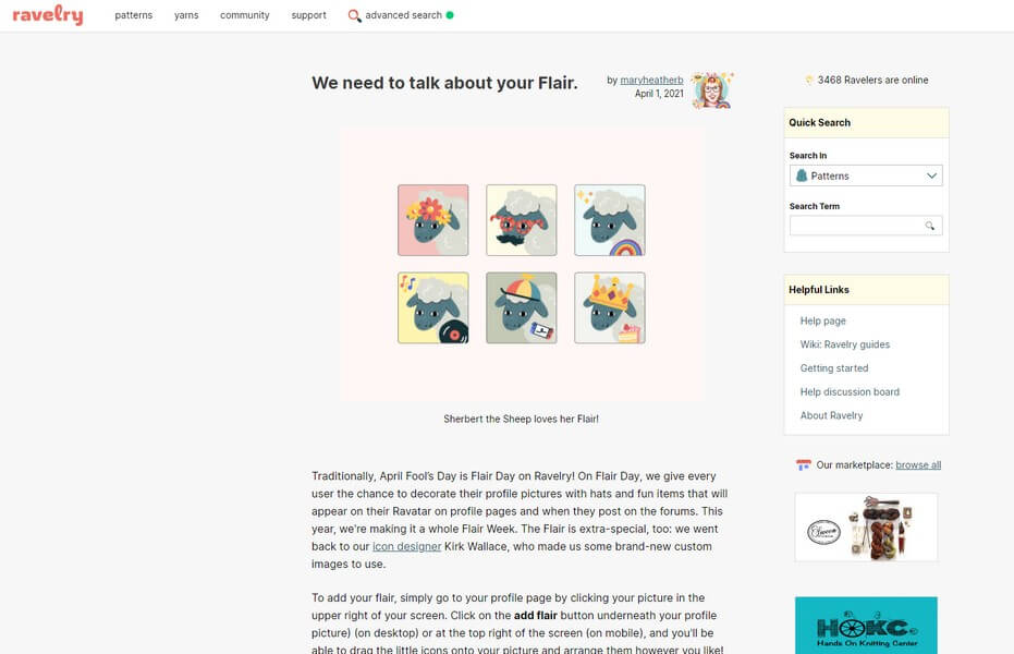
Here’s what the site looks now with the Herdwick skin. I will not add screenshots of “before” because even the screenshots give me migraines and I wouldn’t wish them on anyone.
The modifications work on the Merino skin as well, but I don’t like it because of the sharp shadows, so I will not add a screenshot.
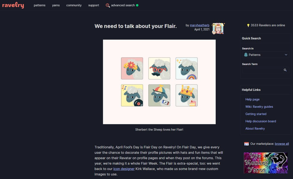
Here’s what the site looks like in dark mode after the modifications, but I won’t be using it because it’s just tiring to me and I need to learn to work on the computer during the day, not at night, anyway.
You will need to follow all steps below for any computer you use to access this website, so I recommend you do it on your home computers, not on any public computer.
2. Get an extension in your browser – Chrome or Firefox
If you use Chrome, you need to get an extension called Stylebot, from here.
If you are a Firefox user, you can get the extension from here.
The page will look something like this, except you will have a different button (mine is already installed and I didn’t want to uninstall it just for a screenshot).
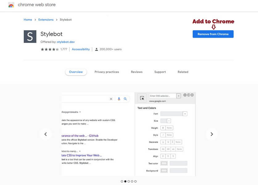
You just click the blue button to add the extension to your browser.
If you use another browser, maybe you can find an alternative to Stylebot that works for your browser.
3. Making the extension work
These instructions are illustrated for Chrome. The steps are similar in Firefox.
Once you have installed the extension, you will have a new button in the address bar, next to your other extensions.
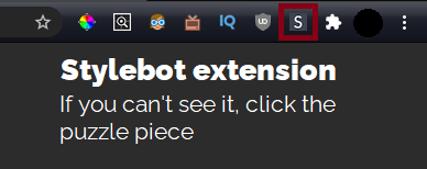
If you can’t see the extension button, click the puzzle piece that will open a drop-down list with all your browser extensions
After you click on the Stylebot extension button, click on Options.
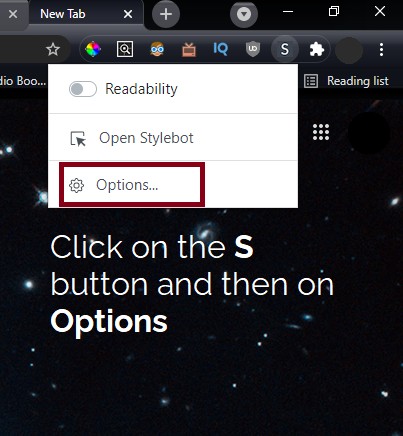
This will open the Stylebot options in a new tab.

Once you are in the Options page, click on the blue Add a new style… button so that you can finally add the custom code.
4. Adding Ravelry custom code
Attention!
Before adding and applying custom CSS code to your browser, always check the code! Don’t copy and paste code from just anywhere, as you might get malicious code without knowing.
I provide this clean code and I hope you can see for yourself that all it does is change the color of borders around a lot of objects on the page, plus a few font sizes to make the page easier to read.
In the URL field, write the following.
*.ravelry.com/*Then add this code to the empty space below.
Click on the view raw button at the bottom to get only the code in a new tab, so it’s easier to copy (use the keyboard shortcuts Ctrl+A to select all, Ctrl+C to copy).
Like this:
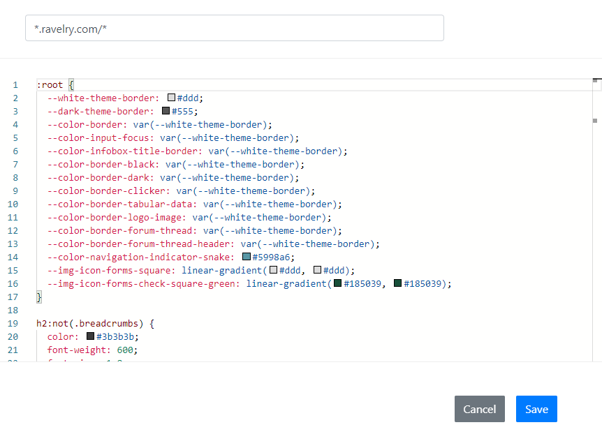
Then click on the Save button to save your new style that applies to all subdomains of Ravelry.
If you want to change some of the colors that I added there, you can do so by simply clicking on the squares next to the # and selecting a color that looks more comfortable to you.
You can also add your own code if you know what you’re doing.
Together with hubby, we’ll be keeping this code up to date, so that even if you see this article a while after it was published, the code you are copying should have the same final effect.
If things change, come back to this page to get the updated code (bookmark it or use the first image in this article to pin it).
From now on, every time you visit the website, the skin should be changed to look more tame, until you decide to turn off the style changes with the toggle.
Now let’s talk a bit about accessibility on Ravelry
This section is 99% rant and you can safely skip it if you don’t want to read ranty me.
I couldn’t leave you there, just like that, after showing you a hack that makes an inaccessible website a bit more accessible to some people (I’m sure there are other issues out there too, besides the black lines that were the most bothersome to my brain).
We need to discuss why we should need a hack to have reasonable access to a website in the first place, especially since said website likes to tout itself as an ally to all disabled folks and as a super highly accessible place.
I can’t just pretend like everything is fine and dandy when it obviously isn’t and we need to scramble around corners to use something that used to be *the place to be* in the yarn and yarn-related crafts world.
As you may or may not know, Ravelry is a platform for yarn lovers who knit, crochet, weave, dye or spin yarn. It’s not embroidery- or sewing-friendly.
It’s like a big database where you can keep a project notebook, buy patterns directly from designers, buy or exchange yarn and talk to other people that like the same things that you do.
The design was never stellar, but it was utilitarian. It was never beautiful or modern, but it didn’t hurt people.
So the owners of the website decided to update it in 2020, to get it in shape, as there are people out there who use screen readers on the internet and it would be nice for them to have access to the platform, as the old theme wasn’t screen reader friendly (or so I understand).
That’s great, but that’s mostly an invisible layer that many people will never interact with.
The way a page is built doesn’t matter to a person who reads a text or sees an image, unless they use a tool that interacts with the structure of the page.
The tool, however, has access to elements that might be invisible to the human eye. That’s what’s great about technology. We can create access within frameworks that already exist.
But the owners of Ravelry decided that with this update to make the website more screen reader-friendly, they would also change the “aesthetics” of the website, as if anyone used Ravelry for its aesthetic value. Ever.
Honestly, I don’t believe a single person ever cared about the aesthetics of Ravelry. It was a tool that didn’t have alternatives that were equally complex or that had as many members.
Hopefully that will change in the future, as more people are building their own platforms that should be an alternative to Ravelry, such as Patternosity.
Now you need to understand that most of the changes that they did are on the aesthetic level. There aren’t new sections in the website, there’s no new functionality, they moved around a few items in the menu and added a new skin to the website.
But what happened when they released the new skin was pain.
Pain in my brain, pain in yours. Pain in many people’s brains. Some even had seizures. If that’s not serious, I don’t know what is.
The first time I tried the new skin, I got a massive migraine during the evening and the following day, after spending 5 minutes on there. So I quickly switched back to the old skin and let it go, hoping that things would change.
How can things change, though, if many people complain, but their complaints fall on deaf ears? Should we still use that metaphor in the times of AAC? I don’t know.
The point is that lots of people complained of migraines and seizures and what did Ravelry do? They closed all communication channels.
All of a sudden, after the update was made public, nobody could write comments on Instagram, nor replies on Twitter to the official Ravelry accounts. There were a few forum topics on Ravelry where hundreds of people complained, but those were quickly locked and probably deleted.
That’s what got me really angry. I don’t mind people making mistakes. But insisting that the mistakes were intentional design choices and will not be changed, while gaslighting the people suffering from something that is easily changed, that’s worthy of anger.
It’s been like that for almost a year. No real feedback is possible. I can’t tell Ravelry that the black lines give me migraines because there is no communication channel available.
There is now a “bug report” form available that now supports a feedback option too, so maybe if you’re interested you might want to tell them that.
I won’t. I tried for almost a year and nobody heard. I even took the completely useless “survey” they created with “different style options” that were the same thing over and over again, no real variation whatsoever, just super subtle changes between one shade of gray and another in the background.
I’ll be using the style hack and will continue adding my patterns over there for the potential random sales that come from people using the platform.
But instead of promoting my designs over there, I will work on increasing the visibility of my shop here on Yarnandy, where I hope you can feel safe and seen, accepted for everything that you are and for your whole person.
I appreciate diversity and our differences, our lived experiences are all valid. I want to learn from you and support you and I also want to listen to you.
There have been lots of discussions lately about diversity in the fiber community and I’d like to explore this a bit more in another article. I mean cultural and biological diversity. Neurological diversity. Diversity of gender and sexuality.
I hope this article has been useful to you and that it will be slightly easier for you to use this platform that doesn’t care about you.
It will surely make my monthly 30 minutes that I spend there much safer…
If you notice anything strange, let me know and we can fix it together.
I hope you’re safe and healthy.
Hugs,
Andrea

9 thoughts on “Making Ravelry more accessible on desktop PCs”